Ethos
Building a design system from scratch for an enterprise SaaS platform
Overview
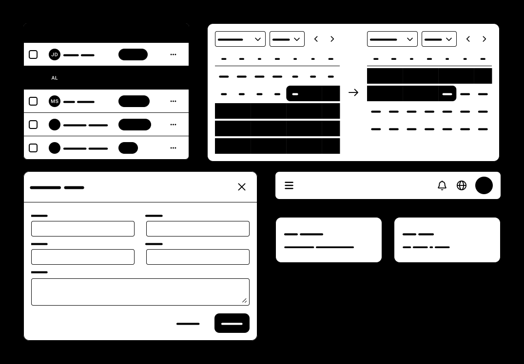
Corcentric is a SaaS company offering AP, AR, and procurement software to businesses of all sizes. In development since 2024, Corcentric Business Network (CBN) is the consolidation of multiple legacy products into one, consistent, easy-to-use platform. To support CBN, I singlehandedly created and maintained Ethos, our company design system, to ensure a consistent, intuitive experience throughout the platform. It features over 40 components and 200 design tokens, providing all the necessary building blocks for our 7-designer team to create well-crafted interfaces.
Context
Corcentric’s product suite was largely acquired from other companies, so it failed to maintain a consistent look and feel, felt jarring to navigate between, and required learning different workflows for the same tasks.
With a new focus on design, a VP of UX was brought in to manage 3 designers scattered throughout the company. Over time, more designers joined the team (7 at peak), but no dedicated UX researcher limited our ability to validate designs prior to release. On the development front, time zone differences limited synchronous communication, making collaboration slower than ideal.
At the time of my departure, CBN was being previewed with select customers, but was yet to ship live.
Building the foundation
As CBN moved from an idea to a very real, multi-year long commitment, I knew if it had any hope of feeling like a unified experience, we were going to need a design system. I had already started creating a design system for the product I was working on, so, on my own volition, I used these foundations to start building Ethos. With capacity already largely dedicated to product design work though, I had to make a couple key decisions that would pay off later:
- Prioritize only the components and styles used most frequently
- Invest in design tokens early
Priorities
To help with prioritization, I had each designer bring UI examples from their respective projects to suss out which components were most necessary up front. This exercise allowed me to narrow my scope down to only the most crucial elements required to build our initial interfaces, such as form fields, buttons, tables, and the overarching navigation paradigm for the platform.
Tokens
I created tokens for our color palette which were then used as values for semantic tokens. With tokens for backgrounds, text, borders, and more, designers were able to choose colors based on their meaning rather than their literal value, increasing overall efficiency of color selection. Using tokens also provided the capability for theming without a large overhaul of existing designs. Adding these tokens from the start was relatively simple compared to the headache it would have caused trying to convert everything down the line.
The audit
Although the design system had been serving CBN for almost 2 years, it still had room to grow. Fortunately, during Q1 2026, design capacity opened up, so I was able to dedicate focused time to Ethos, with the goal of increasing the overall quality of the system, rather than just adding more components or tokens. As I had already been solely maintaining the system autonomously, our design VP entrusted me to continue to drive the work myself, so I planned out a few stages, each to be worked on for 2-3 weeks:
- Perform a full audit of our components
- Document high usage and/or complex components
- Improve the most used components first and add any missing
- Create a changelog located outside of Figma, to be updated with all subsequent releases
I chose a few dimensions to audit:
Variant coverage
I checked each component to see if they were capable of accomplishing what our designers needed them to do, while still applying sensible guardrails in the form of component properties and usage guidelines. Corrections came in the form of additional variants to support common but currently unsupported usecases, removal of variants that were never used, and the addition of more component properties to expose the component’s capabilities to designers more clearly.
Ethos was an early adopter of the Figma Slots feature, which greatly cut down the amount of variants required for components such as checkbox groups or tab strips, and removed the need for designers to detach elements like dialogs or sheets before designing within them.
Interactivity
When performing design QA, components did not always align with what the designer had in mind, especially when it came to interaction. Without any form of documentation, interactions needed to be inferred from Figma prototypes, or more typically, were assumed by the developer as they implemented the component. Going hand in hand with variant coverage, any interactive component needed to account for all the states it could be in, such as resting, hover, selected, active, etc. so that there would be no misalignment on the design or development side as to how a component should behave or look when it’s in various states.
Other dimensions
Each component was also given marks for its priority (determined by Figma’s library analytics), responsiveness, and contrast, along with a detailed ‘notes’ section describing all fixes needing to be applied for a specific component.
What changed
After performing the audit, I found that while most components were fundamentally sound, many had small papercuts that made their usage trickier than needed, such as property inconsistencies, missing interactive states, or missing variants altogether.
Over 30 components were improved, some with purely better Figma usability, and others with changes to their design as well.
One notable component was Segmented Control. Its design presented too similarly to Buttons while functioning more like Tabs, leading to confusion on when/how to use it. Segmented Control was overhauled both with more specific guidelines to distinguish its usage from Tabs, and visually to better separate from Button.
Using the ‘notes’ section captured during the audit, I produced a detailed changelog of every update to the system with before/after examples hosted on Confluence for our development team to have a clear picture of the changes needed to be made.
Documentation
A key signal with all design systems is the dreaded detached instance. A detached instance can happen for many reasons; sometimes the designer needed something outside the component’s capabilities, or sometimes those capabilities were too hidden from designers. As a design system owner, these detachments can be valuable in identifying gaps, but as a developer consuming mockups, detached components cause real problems and sow confusion:
How do I find the original component guidelines?
What’s different in this version, if anything?
Is this a one time override or a new pattern to account for?
Apart from component improvements, documentation was at the top of my list of improvements to be made. Without it, these questions never had concrete answers.
I first improved our existing rudimentary documentation template by performing extensive competitive analysis across design systems to see which aspects they opted to document.
Based on Figma library usage statistics and overall component complexity, 9 high-priority components now feature documentation that includes component anatomy, usage guidelines, examples of all states/variants, and related components. This added documentation helped solve our ‘source of truth’ problem, as the design system now plainly stated exact do’s/don’ts, rather than relying on designers or developers to interpret the canvas correctly.
Finally, this work also raised discussions with the development team to incorporate design system updates as part of their quarterly release cadence, as opposed to only updating components once they were seen in use. This helped to provide more realistic estimates, as design system work was now properly being planned alongside feature development.
Reflection
Dedicating more time to documentation earlier would have eased a lot of confusion. Designers and developers made their own assumptions with no source of truth, leading to discrepancies in mockups and implementations. These assumptions then snowballed until they were caught in review, where more rework needed to happen than if the discrepancy was caught earlier.
Accessibility never got as much of a focus as I feel it deserves. In the Figma library I can validate things like color contrast or text sizing, but in reality many accessibility details come from how the components are implemented in code. Having a more consistent line of communication with the engineering team to correct these issues and incorporate them into documentation sooner would make catching accessibility issues faster.