CharlesVR
Greenhouse Studios
Overview
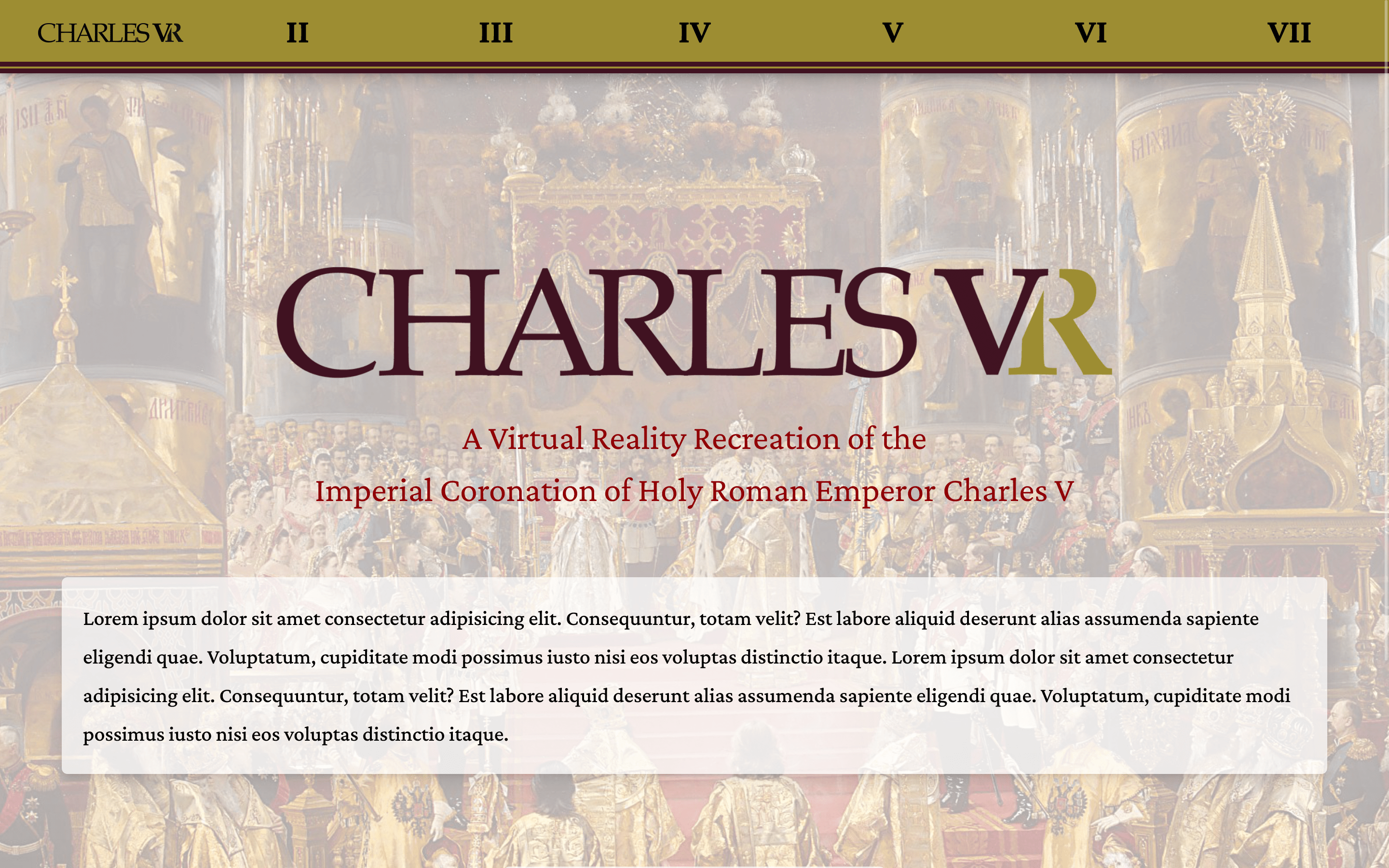
Charles VR is a virtual reality reconstruction of the coronation of Holy Roman Emperor Charles
V in Bologna, Italy, in February of 1530. Complete with direct access to the scholarly and
archival sources that informed our choices, Charles VR offers enthusiasts of art,
architecture, history, music, religion, and virtual reality as well as students and scholars
of those disciplines a multi-modal window into an event of world-historical importance.
As the sole developer of the Charles VR showcase website, I was responsible for improving its overall
functionality and user experience. Initially, my focus was on resolving existing bugs and enhancing
the user experience. However, after working with the old codebase for some time, I decided to rebuild
the website from scratch.
This allowed me to create a more accessible and user-friendly platform, which was my primary goal.
In addition to improving the website's functionality, I was also able to modernize the codebase,
making it easier to maintain and update in the future. Overall, my efforts helped to enhance the
user experience and position the website as a valuable resource for enthusiasts and scholars alike.
Development
As a member of the team, I was tasked with improving the website's overall functionality and
user experience. When I joined the project, the website was built using basic HTML, CSS, and
JavaScript, and it was clear that speed of development had been prioritized over
maintainability and mobile accessibility.
I worked on resolving existing bugs and enhancing the website's responsiveness, making it easier
for users to navigate on mobile devices. To improve the developer experience and facilitate code
reuse, I introduced Pug for templating and converted the CSS to SASS. This not only helped to ensure
consistent styling across the site, but also made it easier to maintain and update in the future.
Overall, my contributions helped to modernize the website and make it more user-friendly.
Svelte Remake
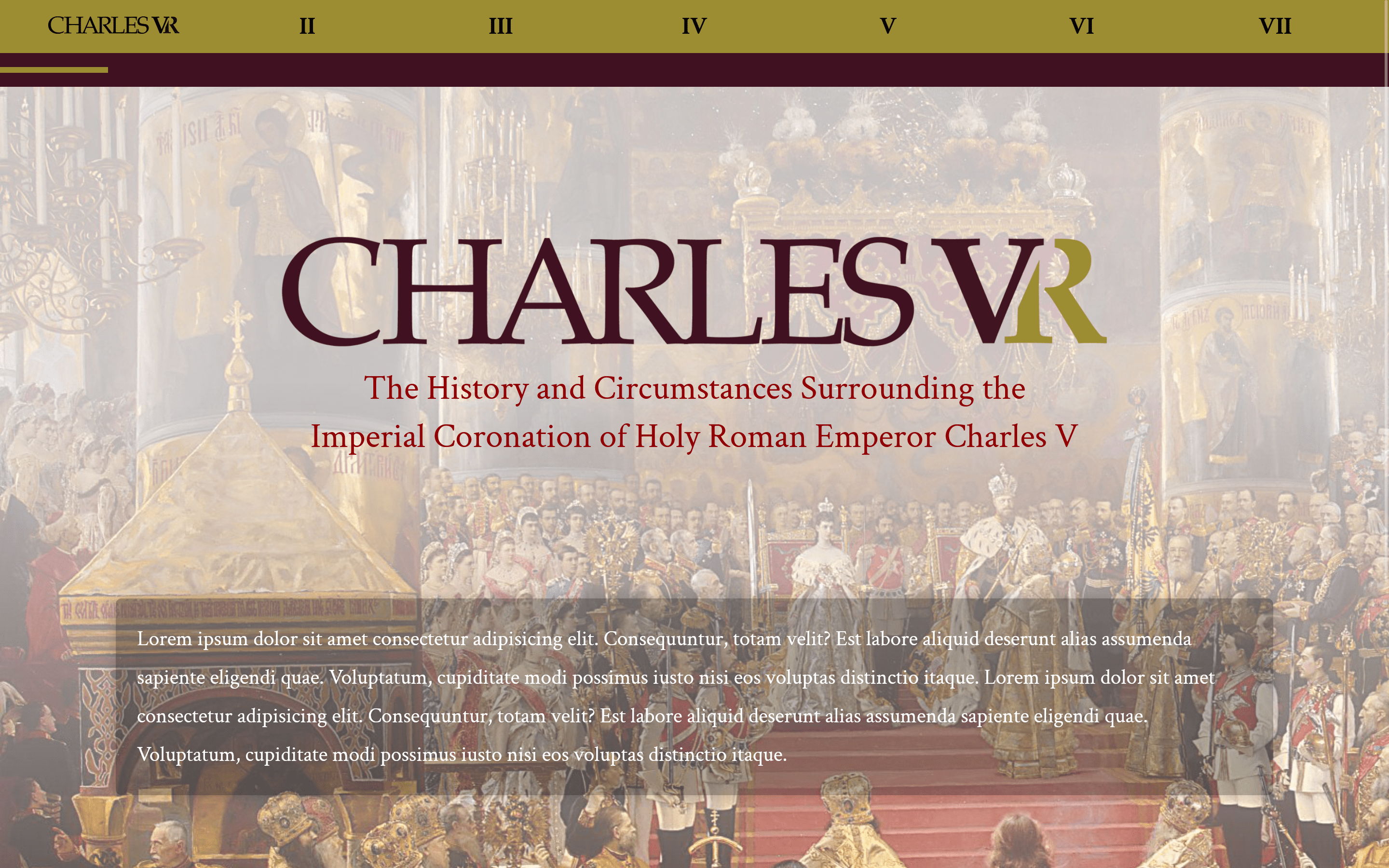
In an effort to improve the website's functionality and user experience, I decided to rebuild
the site from the ground up using Svelte and TailwindCSS. My primary goals were to create a
more consistent and responsive design, and to enhance the developer experience to make future
updates and changes easier to implement.
Svelte was a natural choice for me because of its "vanilla" feel and ease of use, which I believed
would make it more accessible to future student developers. Its component-based structure also
allowed me to reuse code across pages, providing greater consistency and making the development
process more efficient. TailwindCSS was selected for its ability to create a cohesive design and
its simplicity, which made it easy to work with. I also utilized SvelteKit, which enabled server-side
rendering and other features that facilitated deployment.
As of November 2022, the new site is still under development and has not yet been launched. However,
I am confident that the improvements I have made will result in a significantly improved user experience
and make the website easier to maintain in the future.
View all projects
