Sourcery
Greenhouse Studios
Overview
Sourcery is a not-for-profit service that gives researchers access to documents that can't be
found online by paying other researchers (Sourcerers)
to find them. It aims to streamline the process that researchers go through by providing a simple
platform that works at any collecting institution in the service area (New York City, Boston, and
Storrs, with expansion plans).
I joined the Sourcery team in February 2020, and after familiarizing myself with the codebase,
I was tasked with designing and implementing several new features. I also helped migrate the application
from an older deprecated component library to a newer one. These changes both made the app easier
to build and visually more pleasing.
Onboarding Flow
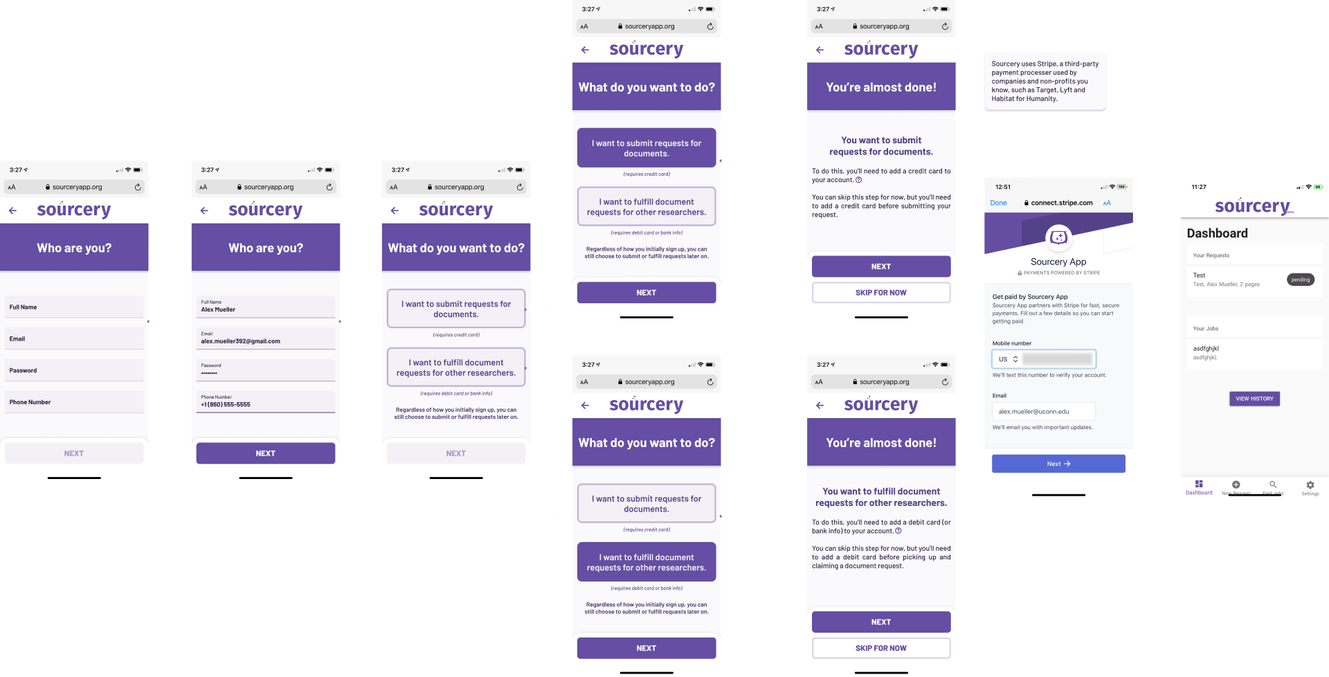
As a designer on the Sourcery team, one of my first tasks was to create a new onboarding flow
for new users. In Sourcery, there are two types of users: Researchers and Sourcerers. This
distinction is important because it determines whether or not a user needs to have a payment
method on file.
To tackle this issue, I started by creating several high-fidelity mockups in Figma. I brainstormed
different ways to present the information to the user, and collaborated with the design lead on the
project to come up with the final design.
Once the design was finalized, I implemented it in the app using Vue and Vuetify. I focused on ensuring
that the flow was intuitive and easy to use, and that the user was informed about the differences
between the two user roles and the payment requirements.
Unfortunately, the onset of the COVID-19 pandemic led Sourcery to pivot to a free payment model,
and this onboarding flow is no longer active. However, it was a valuable experience for me as a designer,
and helped me to hone my skills in creating user flows and implementing designs in code.
Landing and About Pages
When I joined the team, the landing page for the project was outdated and lacked any real
styling. It consisted of a few simple links to the login and signup pages, and included some
illustrations and videos. However, it had not been updated since the project initially
launched, and there had been little to no focus on creating a cohesive visual design.
As a fresh pair of eyes, the team asked me to completely redesign the landing page. I was given
a list of requirements, and started by creating several mockups in Figma. I took inspiration from
other small business landing pages, and aimed for a modern, professional look that would reflect
the brand.
Using Figma's AutoLayout and component features, I was able to quickly iterate on the design and
come up with a draft that I was happy with. The team reviewed the design and provided feedback,
and I made some adjustments to create the final landing page. The new design was a major improvement,
and helped to establish a consistent visual identity for the project.
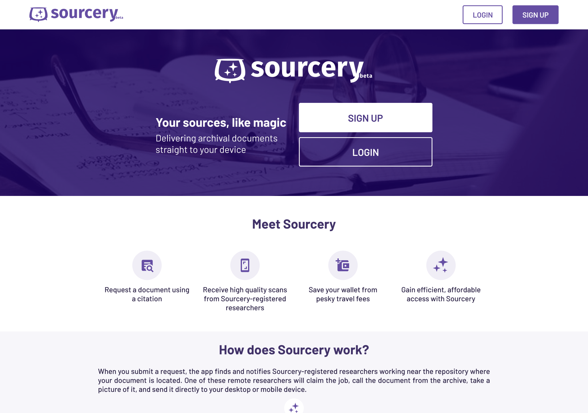
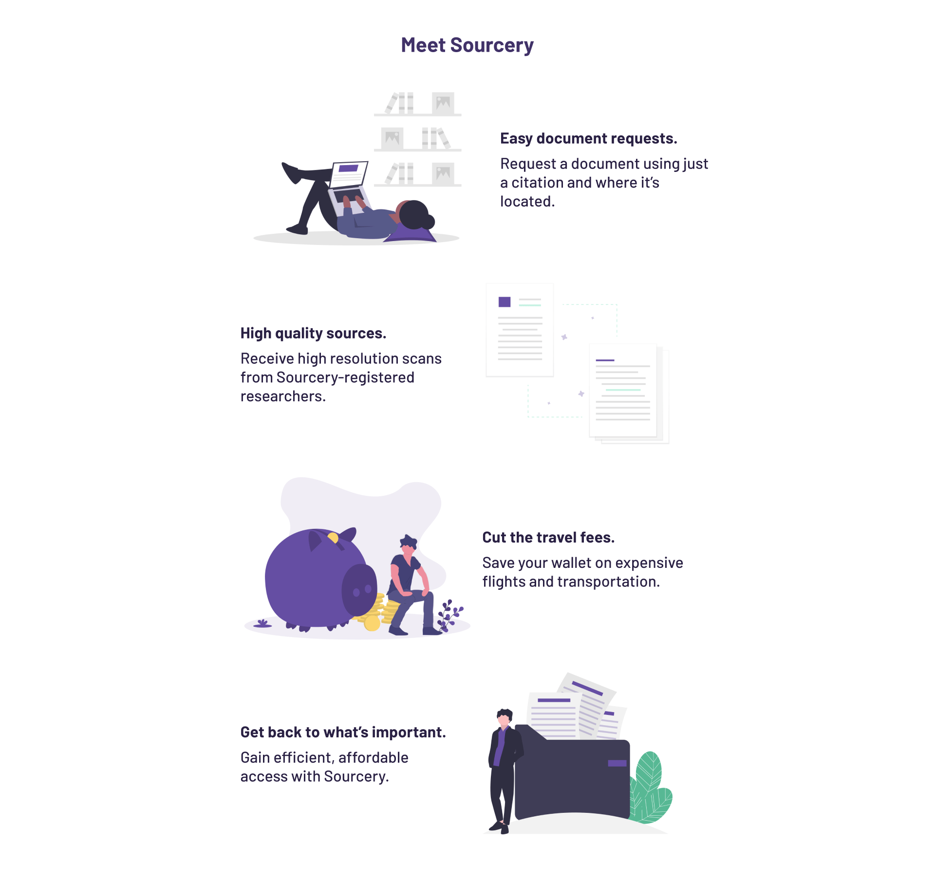
When I started working on the design for the app's highlighted features section, I initially
tried using icons to represent each feature. However, I quickly realized that illustrations
would be more effective at conveying the features at a glance.
I sourced some high-quality illustrations from
undraw.co, and wrote some new
copy to go along with them. I worked closely with the team to incorporate their feedback and
make sure the design was clear and effective.
After several rounds of revisions, I was able to finalize the design and implement it in the app.
The result was a visually appealing and informative section that helped users understand the app's
capabilities at a glance.
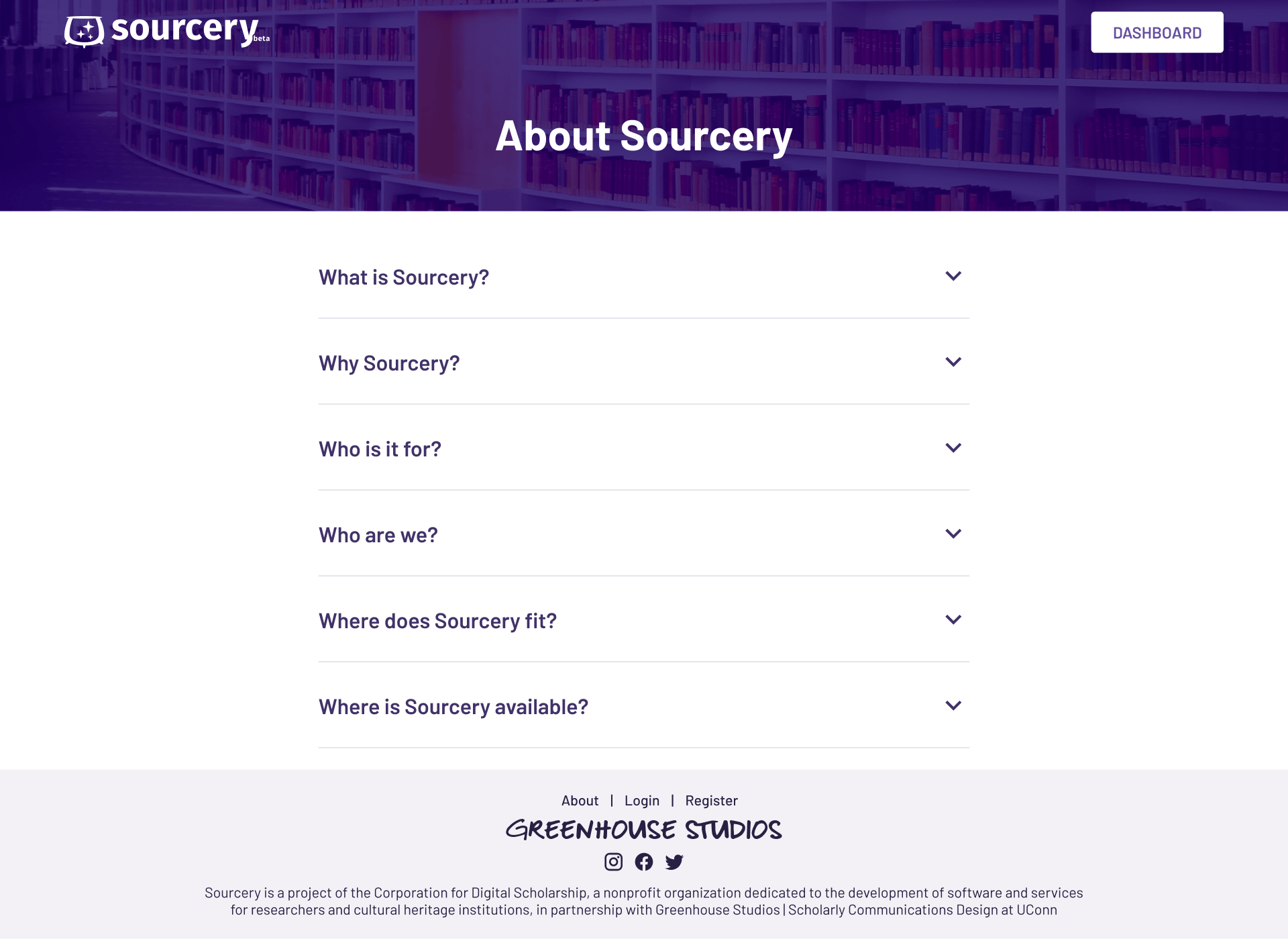
Once the landing page design was complete, I turned my attention to the app's about page. This
page contained important information about what Sourcery is and how it works, but it was
currently only accessible to users who had already created an account.
To make this information more accessible to potential users, I decided to port the about page to
a public page on the website. This would allow visitors to learn more about Sourcery without having
to create an account first.
The about page consisted of several questions and answers contained in dropdown sections. I designed
the page to be clean and easy to navigate, and made sure that the information was presented in
a clear and concise manner.
Overall, the redesigned about page was a success. It provided potential users with the information
they needed to make an informed decision about whether or not to create an account, and helped
to establish Sourcery as a transparent and trustworthy brand.
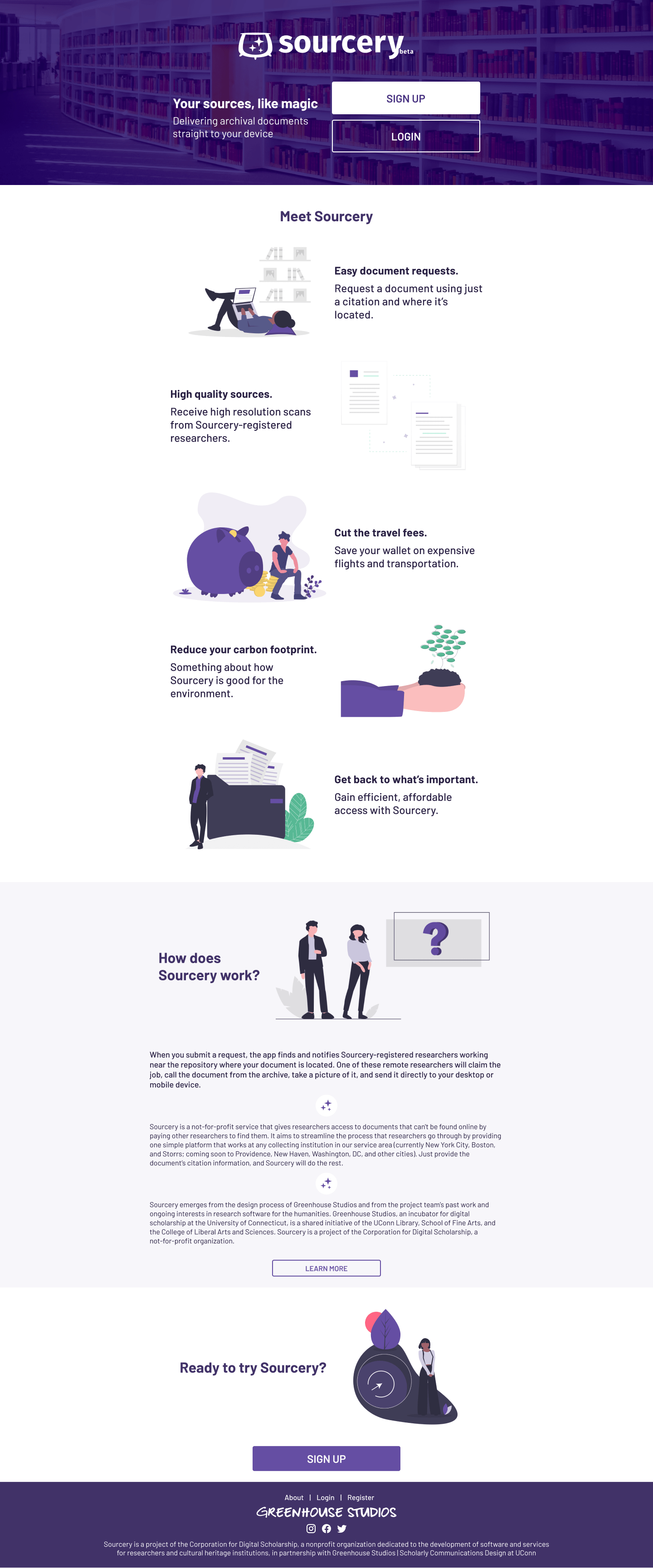
Final mockup (scroll!)
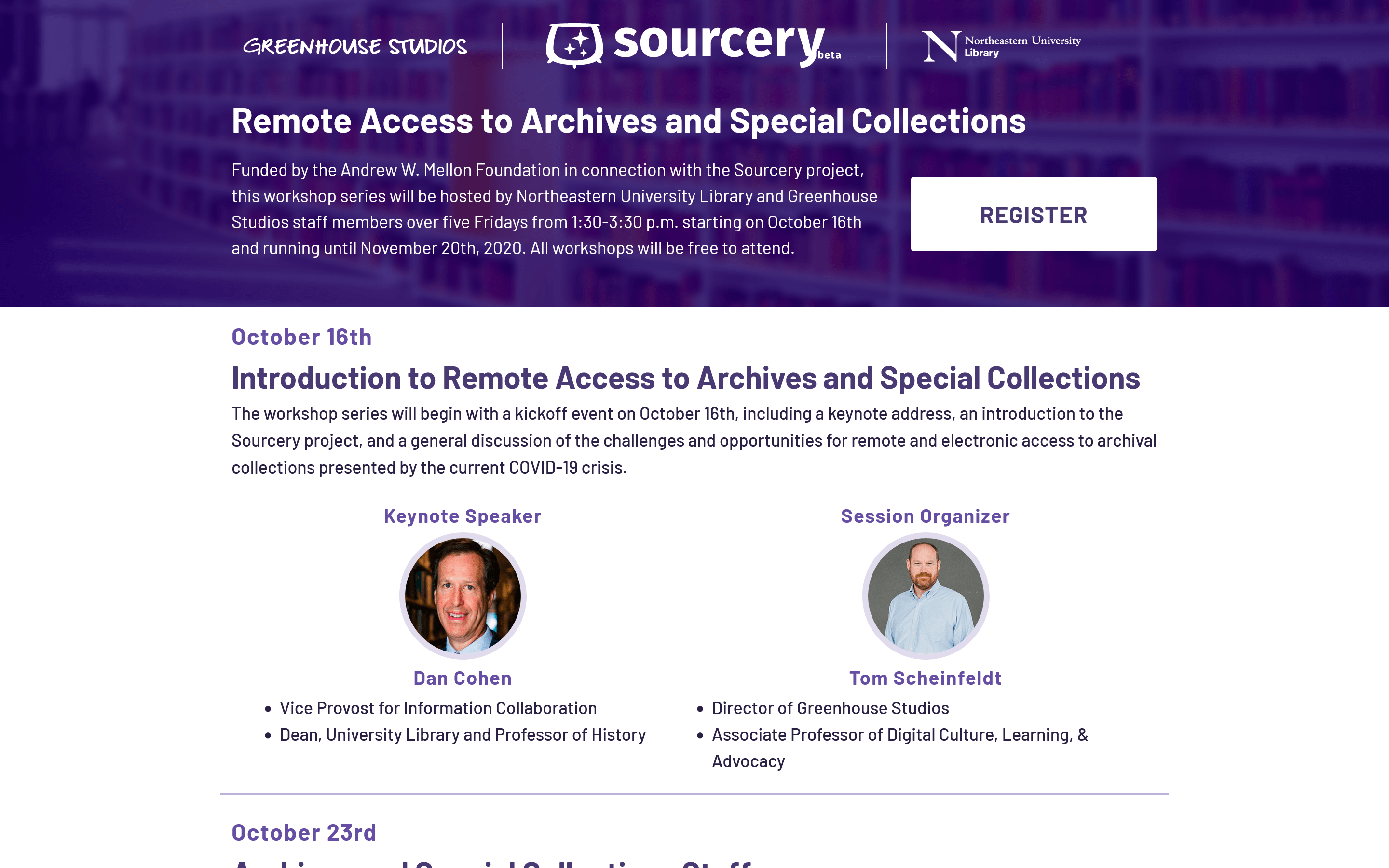
Workshop Landing Page
In 2020, Greenhouse Studios staff and the Northeastern University Library teamed up to host a
free virtual workshop series that focused on remote access to archives and special collections.
The workshops discussed the challenges and opportunities presented by COVID-19 lockdowns, and
provided attendees with valuable insights and tips for accessing these resources from home.
Overall, the workshops were a valuable addition to the Greenhouse Studios and Northeastern University
Library's programming, and helped to provide valuable insights and support to professionals in the
field during a difficult time.
Organization Pages
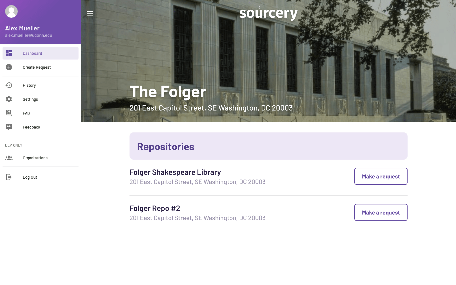
As Sourcery expanded to new regions and institutions, our partnered organizations needed to have
home pages that they could link to. These pages would allow users to request documents from any
of the organization's repositories.
To create these pages, I started by brainstorming different design styles and approaches. I wanted
the pages to include a banner image representing the organization, as well as any relevant information
and a list of repositories.
After experimenting with several different styles, I landed on a design that fit well with the rest
of the Sourcery application and met all of the goals we had set out for it. The design was clean
and professional, and provided users with the information they needed to easily request documents
from the organization's repositories.
Overall, the new home pages were a success, and helped to make it easier for users to access documents
from our partnered organizations' repositories.
Iterations
View all projects
