Leisurely
Student Project
Overview
In 2021, I was approached by a fellow UConn student who was looking to revolutionize the way
we shop. He had come up with an innovative idea for an app that would take the traditional
window shopping experience and make it mobile. The app, which he called "Leisurely," would
gamify the process of looking for products, making it easier and more fun to find the items
you love.
Leisurely would aggregate online stores and allow users to browse a wide range of products, save
them to a wishlist, and ultimately purchase them. The goal was to make shopping more efficient
and enjoyable, and to help consumers find the products they want quickly and easily.
I was thrilled to be brought on board to help develop the app and create a visual identity for
the startup. Working closely with the founder, I crafted a sleek and modern design that would reflect
the app's unique approach to shopping.
Branding
For the branding, I wanted to create something that would be simple, clean, and modern. I wanted to capture the essence of window shopping in the logo, so I came up with a design that was reminiscent of an awning you might see over a storefront. The outline-style logo was versatile and could be used at both small and large sizes. I started by creating the logo in black and white, and then experimented with a few different color combinations. However, when it came time to design the app's user interface, I decided to stick with a black and white color scheme. This helped to emphasize the products being showcased and gave the app a sleek, modern look.
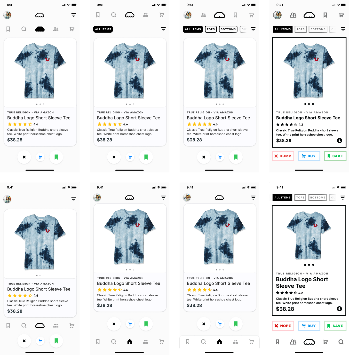
App Design
When discussing the project with the client, he suggested a card-style interface that would
allow users to easily browse through products. He suggested using a swipe left or right
gesture to dismiss or save items to a wishlist, respectively. I thought this was a great idea,
but decided to add a third option where users could swipe up to purchase a product directly
from the app.
In addition to the swipe gestures, I also incorporated a tap gesture that would allow users to
view more information about a product, such as reviews, without having to leave the app. This would
provide a seamless and convenient shopping experience for users.
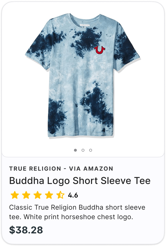
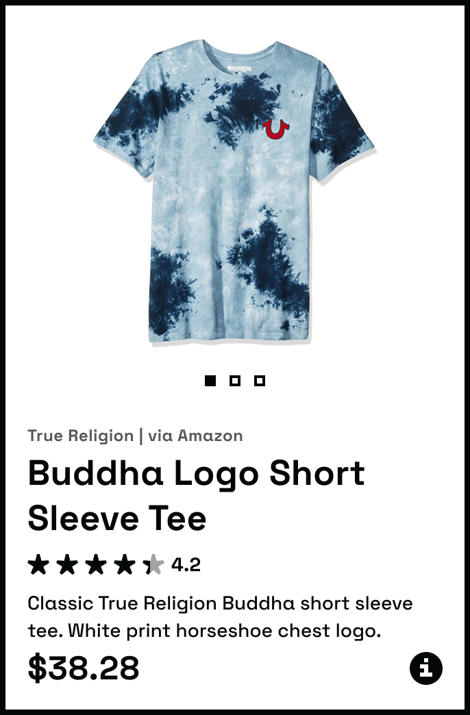
To create the design, I used Figma and the Material Design system. I focused on the design of the
product card, which would feature images of the product, a star rating, a price, a description,
and the store it was from. Once I had the card layout nailed down, I designed the rest of the app
interface around it. I added buttons beneath the card as alternate triggers for the three actions,
and then experimented with different looks until I settled on a bolder style that complemented
the logo.
View all projects